Modelling time series as a language
Time series models normally require the designing of specific features to capture something about the underlying patterns:
- Fourier terms, Radial Basis functions etc in old blog post about linear models
- holiday events
- Calendar features (hour, day of week, weekend)
However, with the recent success of modelling lanugages with enormous amounts of data and processing power, a team at AWS asked
what are the fundamental differences between a language model that predicts the next token, and a time series forecasting model that predicts the next values? … Both endeavors fundamentally aim to model the sequential structure of the data to predict future patterns. Shouldn’t good language models “just work” on time series?
Previous attempts at applying LLMs to timeseries forecasting have consisted of clever fine-tuning of existing models (GPT4TS, Time-LLM) or just asking the LLM nicely (Promptcast). As with all the best ideas, it seems obvious in hindsight that a model trained on language is clearly not going to beat a LLM-type model trained on timeseries data. While it sounds easy on paper, the two major challenges are:
- there is much much more structured text data to learn from when compared to timeseries
- how do we define a “vocabulary” for our timeseries?
The first problem can be solved by taking the clean timeseries data that already exists, like the M competition, and applying a bit of mathematical pick-n-mix to create a wide corpus of training data
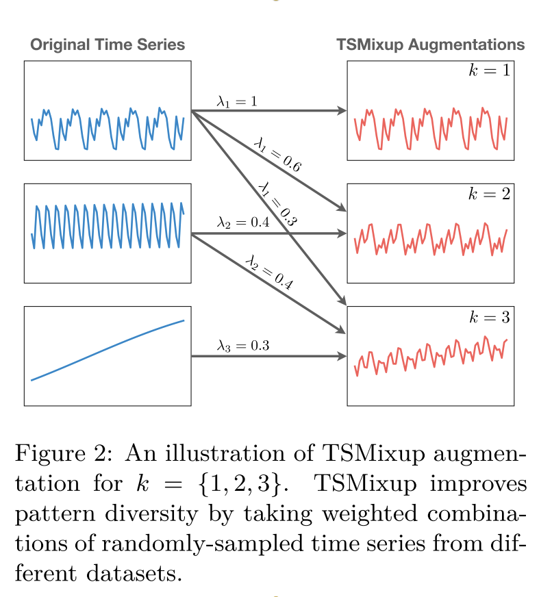
As for vocabulary, the authors scaled and quantized the data into 4096 buckets that represent the tokens.
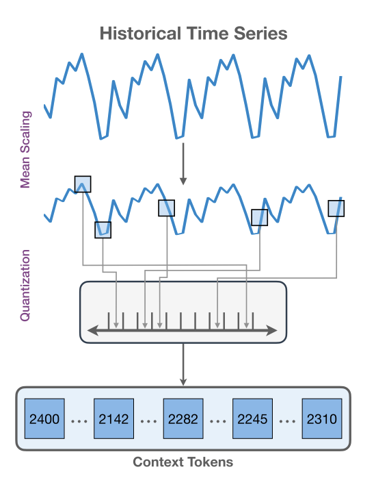
That’s it.
Now all we have to do is borrow the transformer architecture that worked so well for modelling language and applying to the newly generated dataset of timeseries.
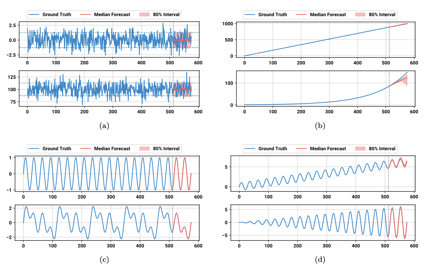
The results are frankly ridiculous for zero-shot forecasting with no special timeseries features.
How does it work?
Sparse autoencoders
Just as we have borrowed the architecture used to train LLMs, we can also apply the same “mechanistic interpretability” techniques used to understand how the model learns “concepts”. These papers are a bit dense, but I understood it much more clearly after reading Illustrated guide to AI. You can see the video version of the chapter here
One of the main take aways is that these neural networks represent more features than they have dimensions for encoding them, known as superposition hypothesis. For any given model, we can train another “sparse autoencoder” to map the neuron outputs at any given layer to concepts. Once we know which combinations of neurons lead to a certain concept, we can find examples in the training text that maximise these neuron patterns. Some legend set up Neuronpedia to easily visualise the findings of 400 different sparse autoencoders on the Gemini models.
While these techniques are now commonplace for language models, they are fairly new for the timeseries equivalents. In March 2026, Mishra 2026 dissected Chronos and discovered that different layers of the network focussed on different classes of features (seasonality, level shifts, change-detection). The jury is still out however, as another paper claims the model predictions did not change much when they purposefully set high neuron activations to zero. They think this could still explain why linear models continue to perform well.
Occlusion
Another way to peek inside the model’s brain is to purposefully occlude data from the input and measure how much worse this makes the forecast. Since Chronos gives us a probability of each token, we can use “Continuous Ranked Probability Score” (CRPS), like they do in Mishra 2026, to estimate the accuracy and precision of the forecast. We can then interpret this, with a pinch of salt, as where the model is “looking” when it makes its predictions.
I knocked up this quick demo to demonstrate the above for a few example datasets, which turn out to be fascinating! (Warning: this is not meant to be scientific, just a bit curious)
For a seasonal pattern, you can see that Chronos is “looking” at the peaks of the pattern at several points in the past:
It’s even more interesting when we add a linear trend term. I interpret the red dots as Chronos trying to find the amplitude for its future predictions
Whereas for a linear trend, no single point is relied on. There is no real change is we occlude a single point (hence all blue)
As Mishra 2026 claimed, Chronos clearly ignores the data before the regime change and also focusses more on recent data
Chronos2
Turns out I’m quite late to the party, as the AWS team has already released a huge improvement with Chronos2 that adds the ability to use exogenous variables through a “group attention” mechanism. I’ll leave that for another time after I have tried these models on my own data at work.