How to create professional figures with Matplotlib
Having recently joined the corporate world I was affronted with figures made in Excel. I had to admit that these figures looked more at home in presentations than my bog-standard Matplotlib efforts.
Clearly, I want to still use Python to create my figures, but want to match the professional look of other’s plots. This also means that I won’t get any push back from my graphs being in a different format.
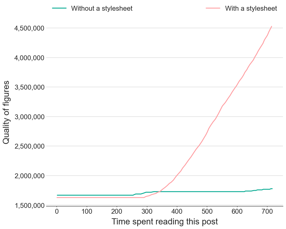
Matplotlib stylesheets provide a way to achieve a consistent styling to your figures, e.g.:
The different elements of the stylesheet are described below, along with some helpful snippets for legends and tick formatting.
This part contains the base seaborn style
# Seaborn common parameters
# .15 = dark_gray
# .8 = light_gray
figure.facecolor: white
text.color: .15
axes.labelcolor: .15
legend.frameon: False
legend.numpoints: 1
legend.scatterpoints: 1
xtick.direction: out
ytick.direction: out
xtick.color: .15
ytick.color: .15
axes.axisbelow: True
image.cmap: Greys
font.family: sans-serif
font.sans-serif: Arial, Liberation Sans, DejaVu Sans, Bitstream Vera Sans, sans-serif
grid.linestyle: -
lines.solid_capstyle: round
lines.linewidth : 2
lines.markersize : 10

# Seaborn whitegrid parameters
axes.grid: True
axes.facecolor: white
grid.color: .8
xtick.major.size: 4
ytick.major.size: 0
xtick.minor.size: 2
ytick.minor.size: 0
Cycle through the branded colours of my organisation (Trainline):
#cycler
axes.prop_cycle: cycler('color', ['00a88f','ff9da1','160078','ffc508','ff6120','004ff9','ac3200'])
Set the grid style and labels:
# grid
axes.grid.axis:  y    # which axis the grid should apply to
axes.grid.which:  major   # grid lines at {major, minor, both} ticks

#font size
font.size : 18
axes.titlesize : 24
figure.titlesize: 24
axes.labelsize : 20
xtick.labelsize : 16
ytick.labelsize : 16
legend.fontsize : 16

# label pad
axes.labelpad:      8.0     # space between label and axis
Following the Excel style, only show the bottom spine
# spines
axes.spines.left:   False  # display axis spines
axes.spines.bottom: True
axes.spines.top:    False
axes.spines.right:  False
Set the date format
# DATES
date.autoformatter.year:        %y
date.autoformatter.month:       %m/%y
date.autoformatter.day:         %d/%m/%y
date.autoformatter.hour:        %m-%d %H
date.autoformatter.minute:      %d %H:%M
date.autoformatter.second:      %H:%M:%S
date.autoformatter.microsecond: %M:%S.%f
Extra Helpers
Format y axis to have comma separated numbers, e.g. $$100,000$
import matplotlib.ticker as ticker
# Just put a , between 000
axs.yaxis.set_major_formatter(ticker.StrMethodFormatter('{x:,.0f}'))

# % symbol
axs.yaxis.set_major_formatter(ticker.StrMethodFormatter('{x:.1f}%'))


# currency
axs.yaxis.set_major_formatter(ticker.StrMethodFormatter('£{x:,.2f}'))
or
from matplotlib.ticker import FuncFormatter
import matplotlib.pyplot as plt
def millions(x, pos):
    'The two args are the value and tick position'
    return f'£{x*1e-6:,.1f}m'


formatter = FuncFormatter(millions)

ax.yaxis.set_major_formatter(formatter)
from here
Legend on top of the plot (guide)
ax.legend(bbox_to_anchor=(0, 1, 1, 0), loc="lower left", mode="expand", ncol=2)
Legend on the right
ax.legend(bbox_to_anchor=(1, 1), loc="upper left")