How do rental bikes move around NYC?
Citibike, the American Boris bikes, have published the details of every ride in their network since 2013 in the hope that “developers, engineers, statisticians, artists, academics” can explore to their hearts content. I was made aware of this dataset through a (unsuccesful) take home test where the goal was to advise Citibike how to distribute their bikes around the city.
After several wasted hours downloading GBs of files, I decided to just focus on visualising the data and seeing if I could come up with a simple model to predict demand at each station. This is a bit of a tired idea (see these other articles), but I knew I’d at least get something to show for my efforts - hence this blog post…
Visualising demand
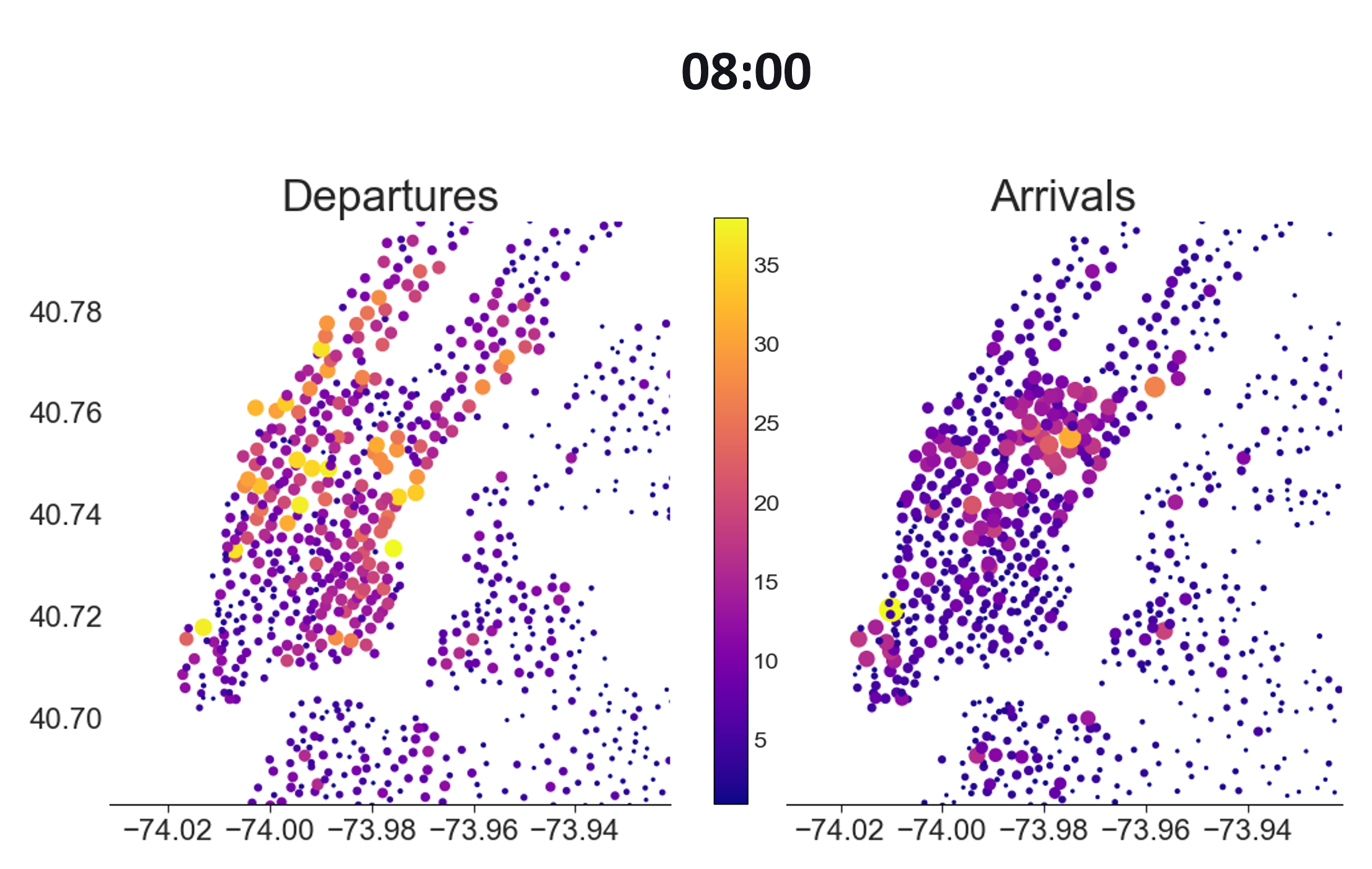
I wanted to show how people commuted to work, and how this could be a problem at peak times. After transforming the data to give the departures/arrivals at each station each hour, I could plot a graph like the one below where each dot is a station and the color/size indicate the number of arrivals
At 08:00 in the morning there is a concentration of arrivals below Central park and the lower left tip. These turn out to be Midtown Manhattan district and the World Trade Center.
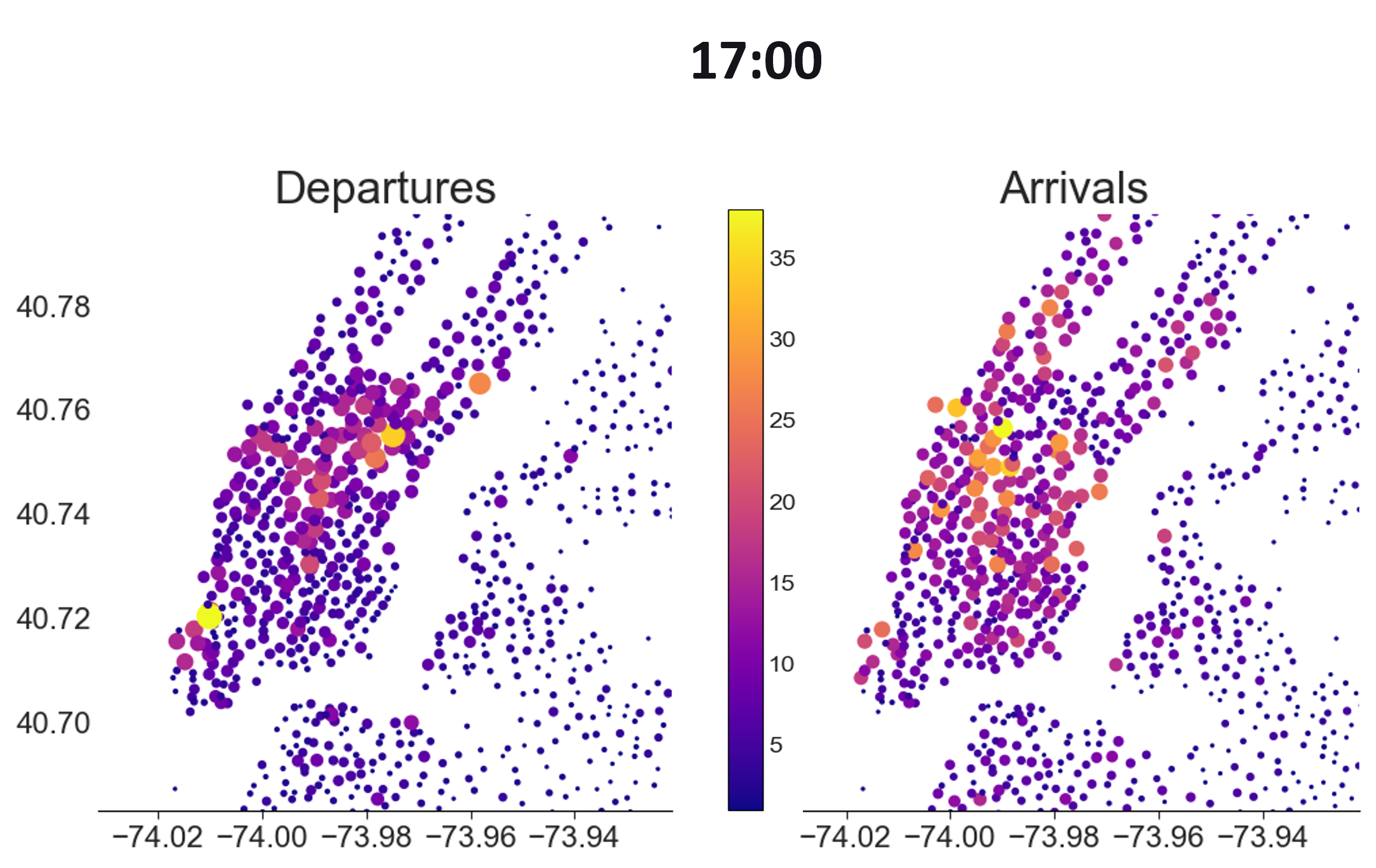
Interestingly, or perhaps obviously, the pattern is reversed for departures at 17:00
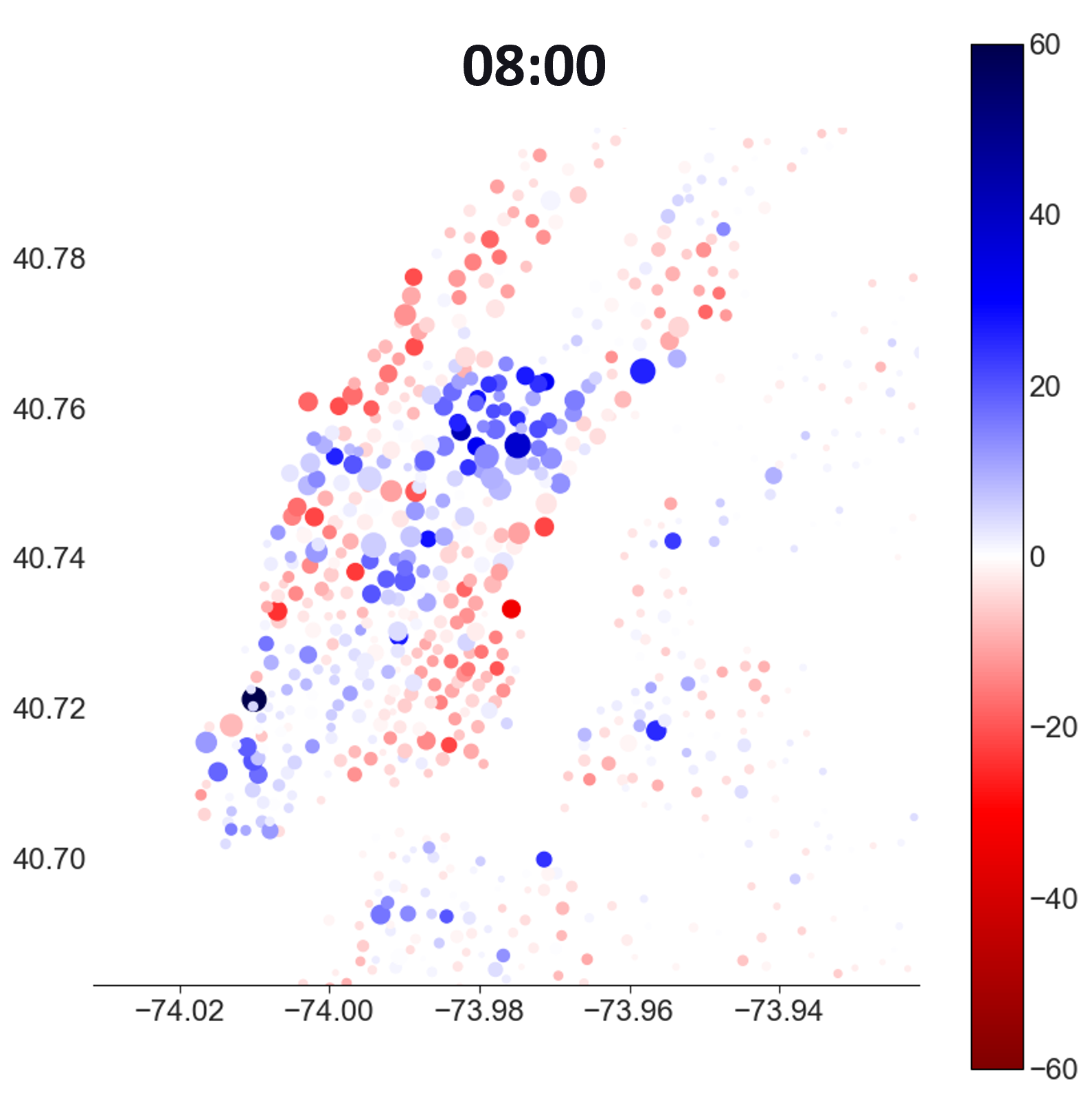
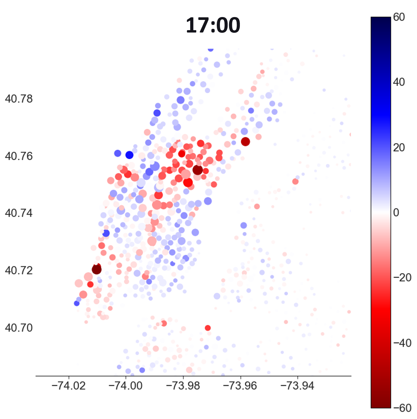
To spot stations where there is a lack of bikes/spaces, I can plot the difference between arrivals and departures (blue for positive, red for negative)
Predicted demand
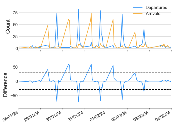
After seeing a clear pattern in commuting througout the city on weekdays, my plan was to then predict the demand and come up with some kind of optimal redistribution of bikes between stations. This type of redistribution is commonplace in bike networks such as this, and is clearly visible at this station (right outside the Citi HQ building…) which regularly goes above capacity (dotted black line)
Each station has its own daily seasonality, so it would not be possible to use the type of statistical model described in my earlier blog post. Instead, we need to create lagged features to capture the historical seasonality for each station which the model can learn from. Below is a demonstration of the lagged windows I chose to use, 6 hours in the previous 1,2,7,8,14,15 days from the dotted red line.
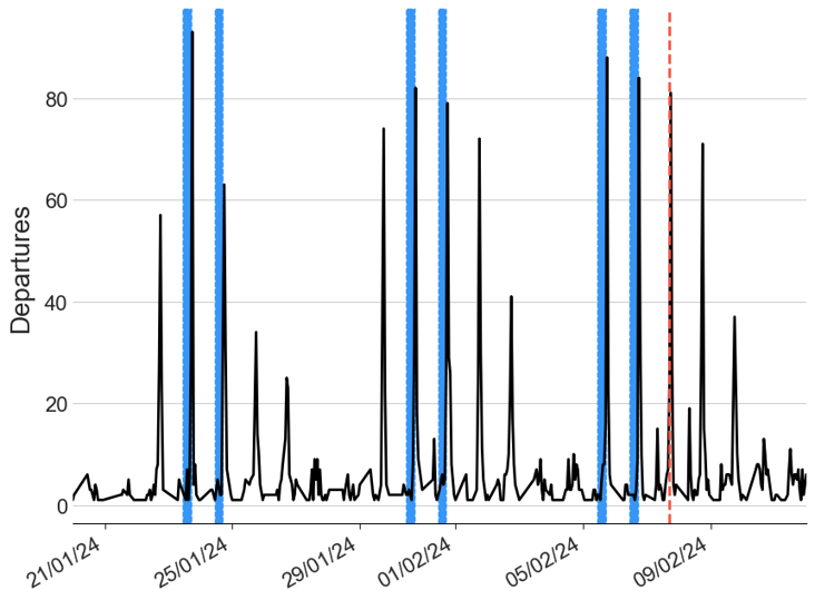
This creates 6*6 = 36 new features for the model to learn from, which seemed reasonable to get a good result quickly. I just ended up using the trusty LightGBM model to get a quick result - I definitely could have done more to tune the model here, but I’m fairly happy with the output!
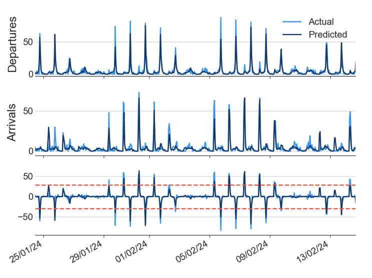
At this point I was thinking along the lines of some kind of linear programming optimisation, like this example, but I could see that getting out of hand with distances between stations etc.
For a proper look at this data, along with all the NYC taxi data I would highly recommend these two posts by Todd W. Schneider: Citibike deepdive, Taxi deepdive.