An interactive guide to linear models
This post, and associated notebook, will cover linear regression along and some of the fancy tricks that can make it an incredibly useful tool. By starting with simple linear models, rather than neural networks, we can learn about some of the associated techniques (e.g. avoiding overfitting) in a cleaner way.
Interactive figure
I have created an interactive visualisation below to explain the underlying concepts and make tools like prophet seem less like magic… For example, try adjusting the coefficients below to model weekly seasonality with one of three linear models (dummy, radial basis function or Fourier). For further explanation, see the seasonality section
This is actually running Python in your browser! Should take about 30 seconds to load, see this previous post or Shinylive
Straight line fit
Before researching for this blog post, I naively assumed that linear regression is restricted to a straight line fit, of the form:
\[y = m \times x + c\]where $y$ is our target variable, $x$ is the feature, $c$ is the intercept and $m$ is the coefficient for $x$.
However, it turns out that the “linear” in linear regression actually refers to the relationship between the target and feature variables, i.e. each feature variable has a single constant coefficient to describe its relationship to $y$. This means that we can rewrite our model in terms of vectors and matrices, allowing us to extend the straight line to many dimensions:
\[\vec{y} = \mathbf{X} \vec{\beta}\]where $\vec{\beta}$ is a vector of $n$ coefficients ($n \times 1$):
\[\vec{\beta} = \begin{pmatrix} \beta_{0} \\ \vdots \\ \beta_{n} \end{pmatrix}\]and $\mathbf{X}$ is a ($ i \times n$) matrix containing the feature variables:
\[\mathbf{X} = \begin{pmatrix} 1 & x^{(0)}_{1} & \cdots & x^{(0)}_{n-1} \\ \vdots & \vdots & \ddots & \vdots \\ 1 & x^{(i)}_{1} & \cdots & x^{(i)}_{n-1} \end{pmatrix}\]When we “fit” our model to the data, we are changing the values of the coefficients ($\vec{\beta}$) with the aim of minimising the error between the observed data and our predictions. This is normally represented by the mean squared error (MSE).
With a bit of linear algebra, we can solve this equation analytically, leading to $\hat{\beta}$ minimising the mean squared error:
\[\hat{\beta} = (\mathbf{X}^{T} \mathbf{X})^{-1} \mathbf{X}^{T} \vec{y}\]Later on, we will see how we can avoid overfitting by modifying the loss function to include some form of regularisation.
After fitting our model, the coefficients can instantly tell us the effect of each of our feature variables. For example, we could say that for every $1^{\circ}$ temperature increase we expect the chance of rain to decrease by X amount. Such a simple statement is notoriously hard to make when using more complicated models, like neural networks.
Seasonality
But what if our data shows some structure?
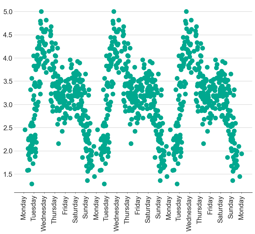
For example, I have created some fake data that has a clear weekly seasonality. How can we possibly model this with a straight line? Well, with some clever feature engineering tricks, we can create a whole host of new features to model complex situations like this.
Dummy variable

Demonstration of dummy variables with the figure at the top of the page
Using our intuition, we might think it is sensible to try and calculate the contribution from each day of the week. This can be represented by creating a dummy variable for each day, where $x_{\textrm{Monday}}$ is only equal to $1$ on a Monday and $0$ everywhere else. We can then scale this new feature with a coefficient, $\beta_{\textrm{Monday}}$, that represents the average $y$ on a Monday.
This new feature can be created with the following code:
def dummy(x, start, width = 1):
    # repeat every 7 days
    x_mod = x % 7
    # Create a boolean array where True is set for elements within the specified range
    condition = (x_mod >= start) & (x_mod < start + width)

    # Convert the boolean array to an integer array (True becomes 1, False becomes 0)
    return condition.astype(int)
While these dummy variables are useful for demonstrating that coefficients effectively represent the height of each feature, the final result does not look natural. The step-like shape means that we are expecting a significant change as soon as it goes 1 minute past midnight!
Radial Basis Functions
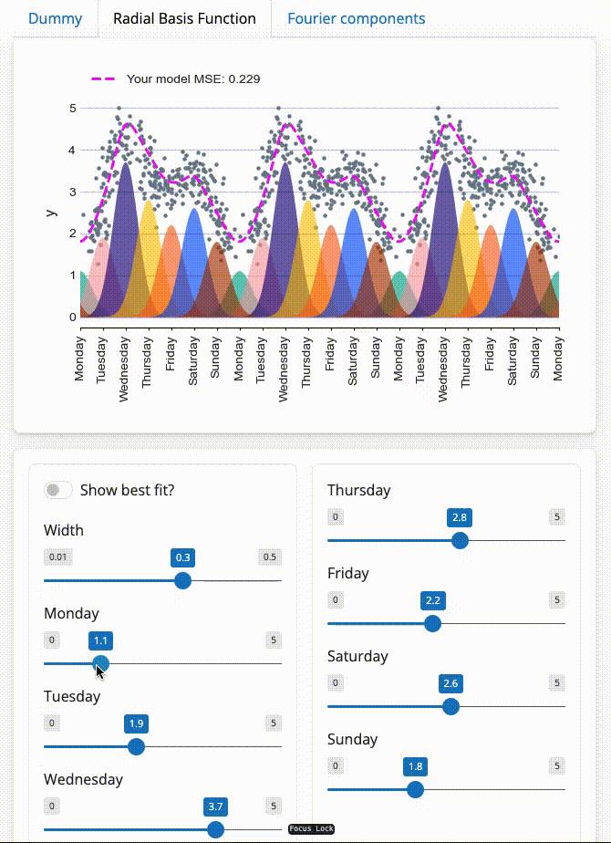
To create a smoother seasonality pattern, we can replace the step function with a repeating Gaussian distribution centered around each day of the week. This is referred to as a radial basis function:
\[y = e^{- (x - \textrm{center})/(2 \times \textrm{width})}\]This now lets the influence of a single day seep into adjacent days, leading to a much more pleasing final fit.
We can create the new features with the code below:
def rbf(x, width, center):
    # repeat every 7 days
    x_mod = x % 7
    center_mod = center % 7

    # Original Gaussian
    gauss = np.exp(-((x_mod - center_mod)**2) / (2 * width))

    # Gaussian shifted by +7
    gauss_plus = np.exp(-((x_mod - (center_mod + 7))**2) / (2 * width))

    # Gaussian shifted by -7
    gauss_minus = np.exp(-((x_mod - (center_mod - 7))**2) / (2 * width))

    # Sum the contributions
    return gauss + gauss_plus + gauss_minus
You may have noticed that we know have an extra variable width, which controls the width of our individual Gaussian functions. This variable is not actually part of the Linear regression, but is used to generate the features that the model learns from. This is therefore a hyperparameter that we can tune.
For example, try changing the width parameter in the top figure to see how it affects the MSE
Fourier components
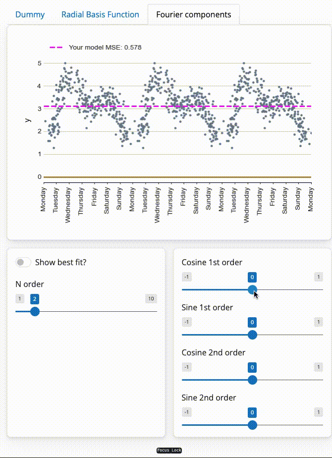
We can also model seasonality with Fourier components, which less prone to overfitting than the radial basis functions above.
This trick works because any function can be represented as a sum of infinitely many sine and cosine waves added together, known as a Fourier transform, as demonstrated below.
Therefore, we can create a new feature for each of these sine and cosine waves, with each coefficient representing the amplitude of that individual sine wave. This is equivalent to the coefficients that can be found by performing a Fourier transformation. The only difference is that we cannot have infinitely many sine waves in our linear regression, however, this is actually helpful to avoid overfitting!
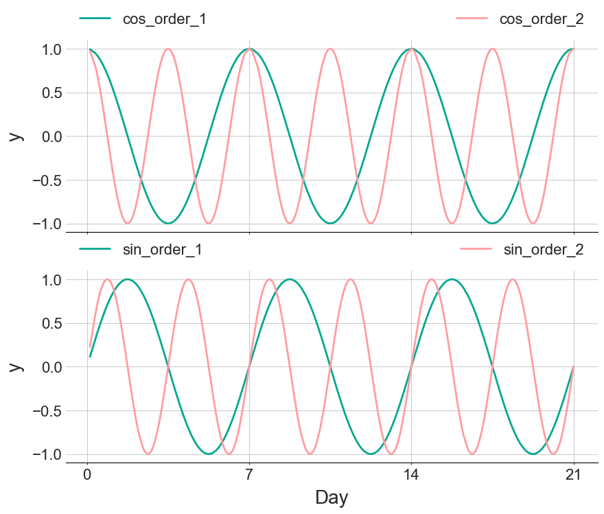
The figure below displays the first and second order Fourier components that are used in the interactive figure
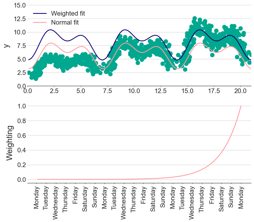
Weighting
What if I don’t trust old data as much as recently recorded data?
Many fitting libraries, such as scikit-learn, allow you to specify an importance to each of the data points. Therefore, we can give exponentially decaying importance to older measurements as a way of ignoring potentially misleading historic data. The amount of “forgetfulness” then becomes another hyperparameter in our model.
Interaction terms
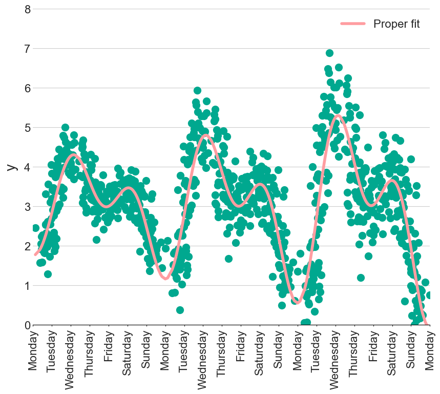
what if the seasonality changed over time?
In the figure below, the amplitude of the seasonality component is increasing each week. Not to worry, we can just create several extra features representing the interaction of day of the week with time. However, this kind of feature engineering can become tedious, hindering our flow. We now want to describe our models with a statistical language. For example, a straight line fit ($y = m \times x + c$) would be written as
y ~ 1 + x
with the 1 representing the intercept, with a coefficent being automatically gerenated for each variable, x. This might seem like overkill for such a simple model, but the real beauty becomes apparent with more complex problems…
Returning to the changing seasonality problem, we might start by saying there is an interaction between time, t, and the first Fourier cosine component, cos_1:
y ~ 0 + t*cos_1
The * operator will automatically generate coefficients for t, cos_1 and the interaction between t:cos_1
Note: In the notebook, the patsy package is used to convert these statistical formulas into a feature vector

After fitting this formula, we get three coefficients that we can interpret as:
- For every 1 unit of
t, y will reduce by 0.01 (negative slope straight line) - The base amplitude for the
cos_1variable is -0.41 - For every unit of
tthis amplitude will reduce by another -0.04 (making the amplitude larger)
Including the full interaction terms is as easy amending the formula like so:
y ~ t * (cos_1 + sin_1 + cos_2 + sin_2)
which will autogenerate 9 features and coefficients
However, there is no free lunch in modelling. Although we can now create hundreds of features using this statistical language, we now need to keep control of them…
Avoiding overfitting
One of the hardest parts of fitting any model, either simple or complex, is making sure we don’t overfit. We want to capture the general shape of the observed data, but do not want to perfectly predict each point, as this will just be fitting the noise rather than learning the underlying pattern.
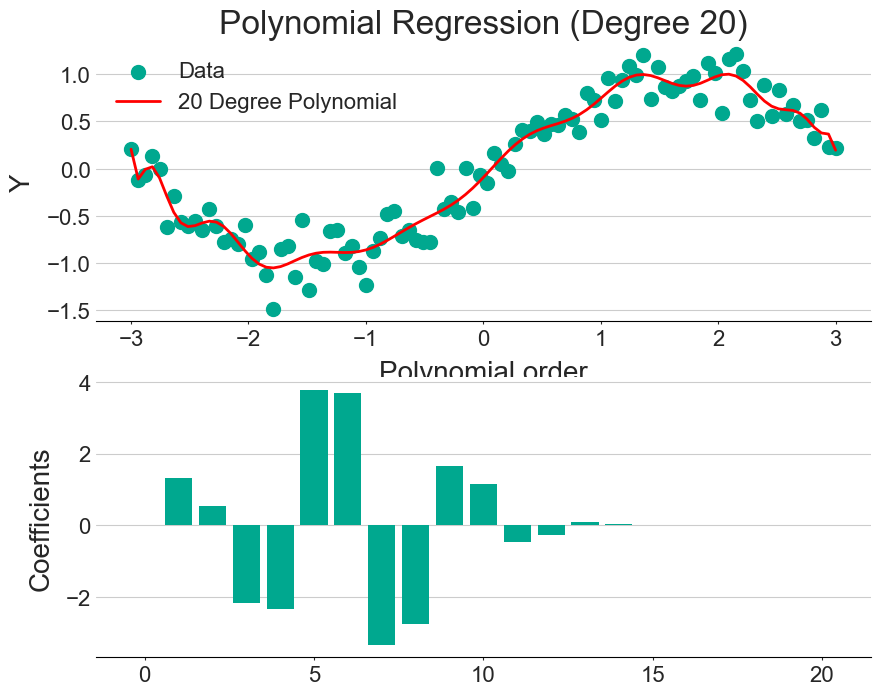
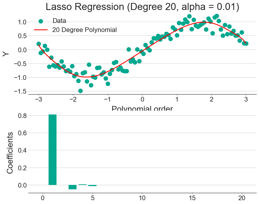
One way to combat overfitting is with a technique called regularisation, which adds a penalty term to the regression formula. Since the model will be penalised for each variable it adds, only the most useful features are included. This can be seen by comparing the figures above (regular fit) and below (with regularisation).
The exact form of the penalty can change, with the two main being LASSO and RIDGE regression having a linear and quadratic penalty term, respectively.
An alpha parameter is often used to specify the trade-off between the model’s performance on the training set and its simplicity. So, increasing the alpha value simplifies the model by shrinking the coefficients.
Bayesian framework
At this point, you might be wondering what are the uncertainties on these coefficients?
While we can solve linear regression with matrix operations (as shown earlier), this is not the best way to understand the sensitivity in our coefficients. Instead, we can fit our model within a Bayesian framework. Not only will this automatically provide an uncertainty estimate in the form of a posterior distribution, but we can actually incorporate domain knowledge into our fitting (through the prior distribution).
To explain how, we first need a quick crash-course in Bayes’ theorem (or read this introduction).
Bayes’ theorem allows us to mathematically update the probability of an event happening, $P(E)$, based on some new data, D.
\[P(E|D) = \frac{P(D |E) \times P(E)}{P(D)}\]For example, we might be playing a game of heads or tails where I have to guess the coin face. I give you the benefit of the doubt and initially believe that there is a 50/50 chance of the coin being fair, $P(Fair) = 0.5$, which is called my prior assumption.
If you get three heads (3H) to start the game, do I still believe the coin is fair?
If the coin is fair, then on each coin flip the probability of getting heads is 50%. So the probability of $n$ heads in a row is equal to
\[P(H|\textrm{Fair}) = 0.5^{n}\]We will assume that if the coin is not fair the probability of $n$ heads is
\[P(H|\textrm{Not Fair}) = 0.75^{n}\]On each coin flip, I can update my beliefs to get a posterior probability, i.e. $P(Event|Data)$. Doing the maths, we can say that:
So, maybe we need to have a chat…
Using this analogy, we start off by assuming a prior distribution for each of our linear regression coefficients (usually just a Gaussian). We can then use Bayes’ theorem to update our beliefs of these coefficients, given the observed data. With each new data point, we get a better understanding of the posterior distribution for each function!
This gets even more fun when you realise we don’t have to use the standard Gaussian priors. We can actually set up the priors to include knowledge we already have about the problem, i.e. we might already have some idea of what the seasonality should be, allowing a fit that might not be normally possible with limited data.
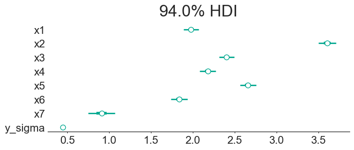
The above figure shows the final coefficients along with the 94% confidence interval. This allows us to quote things as “we are 94% confident that Sunday gives an extra 0.746 to 1.071 units”. We can also make statements such as “we are the least sure about the 7th day”. Interestingly, the model is very confident on the amount of noise in the data (the y_sigma parameter), probably because I made this fake data with a single noise parameter…
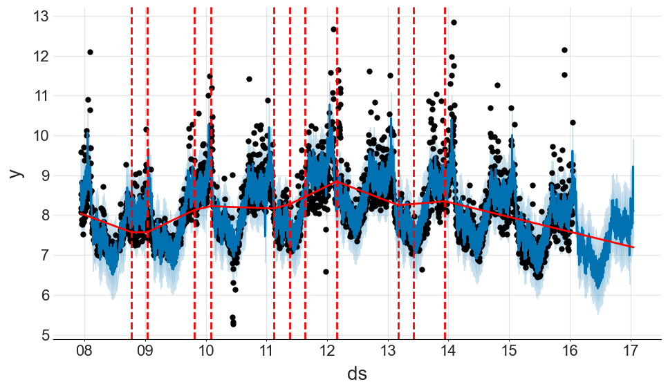
Comparison to the prophet model
The prophet model from Facebook provides many of these functionalities straight out of the box, and does such a good job of abstracting this complexity away that it kind of seems like magic. However, it is important to realise that prophet is just using some of the tricks from earlier:
- Is a linear model
- Models weekly seasonality with radial basis function dummy variables
- Models yearly seasonality with Fourier components (which you can change the order of with the
yearly_seasonalityparameter) - Can fit in a Bayesian framework, giving uncertanties in the final predictions
To be fair, prophet also has a few tricks up its sleeves: it can model increases in sales on holidays in that region; handle logistic growth (along with changepoints) as well as deal with gaps in the data.
I would personally use prophet to rapidly experiment with seasonality, holidays and extra regressors. I would then re-create the model in PyMC to add more custom features, see this example of how to do this.
As an demonstration of how simple prophet is, we can condense most of the ideas in this blog post to the following code:
m = Prophet(
    weekly_seasonality = True,
    yearly_seasonality=5
)

m.add_country_holidays(country_name='USA')

m.fit(df)

future = m.make_future_dataframe(periods=365)

forecast = m.predict(future)
forecast[["ds", "yhat", "yhat_lower", "yhat_upper"]].tail()
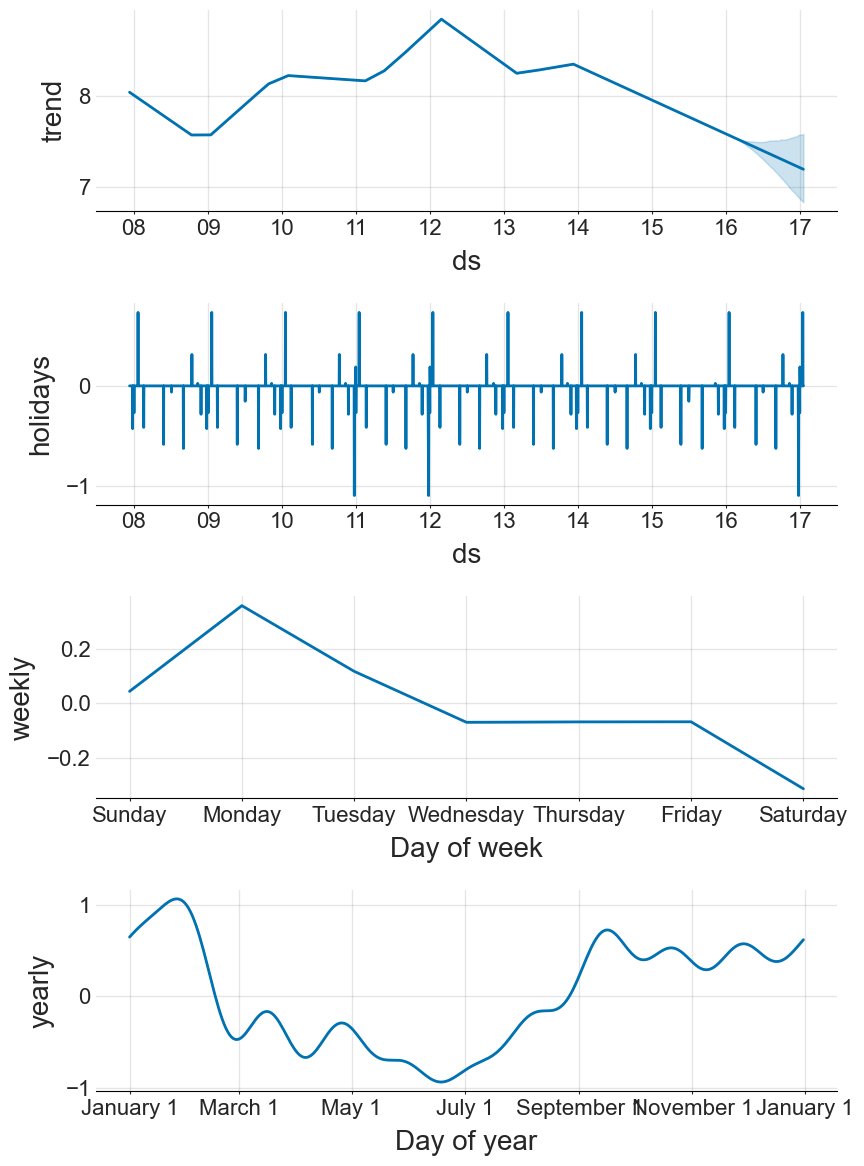
We can also break down each of these components to extract more information
For a more detailed tutorial, see the official documentation
Acknowledgments
This post, and associated notebook, is heavily inspired by this fantastic talk by Vincent Warmerdam, along with this notebook investigating cycling patterns in Seattle.